Type...Revealed! Type Museum 2020
Various deliverables including: RISO print & laser cut invites, RISO print event programs, RISO print revelation cards, large format interactive wall exhibit, social media platform, silkscreened tote bags
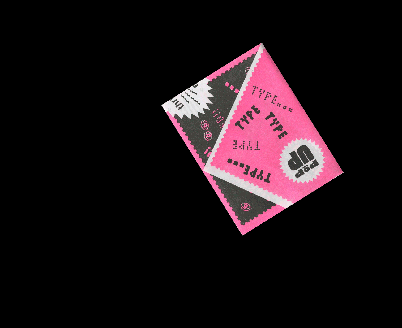
Type...Revealed! is Emily Carr University of Art + Design's 8th annual Pop-up Type Museum, an event put on by the fourth year Advanced Typography class in conjunction with Vancouver's own Type Brigade.
As part of the branding team for this year's Type Museum, I took on the role of creative director and designer. Working together with two of my colleagues, I oversaw the direction for the overall brand identity & aesthetic, and designed multiple assets, such as the invites, the revelation cards, and worked alongside Triet for the other assets in order to ensure a cohesive look amongst all parts of the show.
Collaboration with Triet Pham & Sahil Mroke. Motion graphics and social media managed by Sahil Mroke. "Pop-Up Type Museum" Logo designed by Triet
– Creative Direction
– Typography
– Exhibition Planning
– Print Design
– Copy Editing


BUTTONS FOR OPENING NIGHT
A question that we stumbled upon early on as a team, was coming up with an overarching theme for the show. How do we come up with a theme that could logically encompass the creative diversity of everyone’s process but still act as its own stand-alone unique brand identity?
At first, this seemed like a difficult task, until we realized that although each exhibition was so different, they all aimed to expose–or reveal–something about typography to the audience, whether that was educational, cultural, or aesthetic. That’s how we came up with the phrase: Type...Revealed! The theme of this year’s museum – one that alludes to the inclusion of everyone’s diverse explorations while also implying an air of mystery, intrigue, and fun – enticing the public to come discover the show.
After solidifying our overall theme, we played around with what the visual identity of the museum might look like. At first, Type...Revealed! was actually called Type...Exposed! But that reminded us too much of cheesy tabloid magazines. However, we couldn’t help but enjoy the urgent and over the top visual language that cheesy tabloid “exposed!” magazines provided. Luckily for us, the overall theme of revelation and exposition allowed us to fully embrace certain over-expressive and loud aesthetics that we liked, whilst tying back nicely to our intentions of keeping the visual identity playful, fun, and cheeky.